Components
Pre-built Next.js components to make your life easier
In the last guide, we initialized Stack. This time, we will take a quick look at some of the most useful Next.js components.
For the full documentation of all available components, please refer to the components reference.
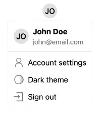
<UserButton />
The <UserButton /> component shows the user's avatar that opens a dropdown with various user settings on click.
import { UserButton } from '@stackframe/stack';

export default function Page() {
  return (
    <UserButton />
  );
}
<SignIn /> and <SignUp />
These components show a sign-in and sign-up form, respectively.

import { SignIn } from '@stackframe/stack';

export default function Page() {
  return (
    <SignIn />
  );
}
All of Stack's components are modular and built from smaller primitives. For example, the <SignIn /> component is composed of the following:
- An
<OAuthButtonGroup />, which itself is composed of multiple<OAuthButton />components - A
<MagicLinkSignIn />, which has a text field and callsuseStackApp().signInWithMagicLink() - A
<CredentialSignIn />, which has two text fields and callsuseStackApp().signInWithCredential()
You can use these components individually to build a custom sign-in component.
To change the default sign-in URL to your own, see the documentation on custom pages.
Others
Stack has many more components available. For a comprehensive list, please check the documentation on components.
Next steps
In the next guide, we will do a deep-dive into retrieving and modifying user objects, as well as how to protect a page.